Viewing Charts
In this section, you will get to know how to view charts namely line chart, bar chart, scatter chart, and line3D chart.
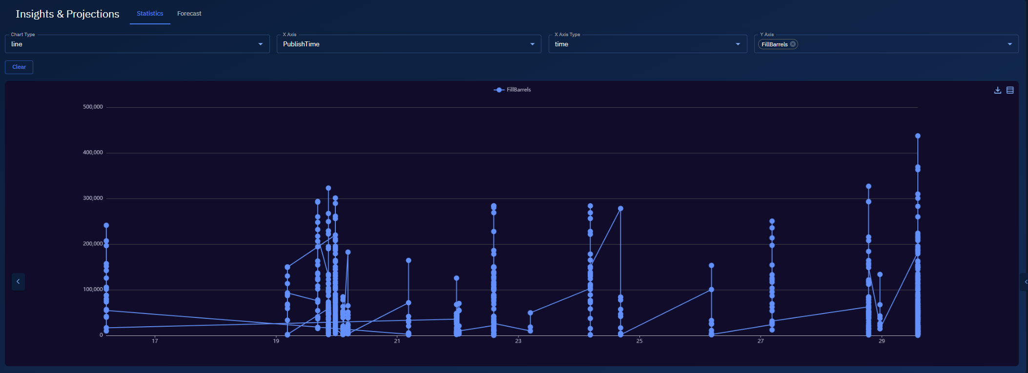
Line chart
Use a Line chart to visualize trends over time.
Pre-requisities
-
Your
.csvis uploaded and mapped. -
You know which column is a timestamp and which is a numeric measure.
To view a line chart, do the following:
-
Open your Workspace that contains the mapped
.csv. -
Select the Insights tab, and then select the Statistics tab.
-
To view chart, do the following:
- In Chart Type drop-down list, select the Line option.
- In X-Axis drop-down list, select your timestamp column (e.g.,
CaptureTimeorPublishTime). - In X-Axis Type drop-down list, select the Time option.
- In Y-Axis drop-down list, select a numeric column (e.g.,
FillBarrelsorCapacityBarrels).
A time-series line chart is displayed.
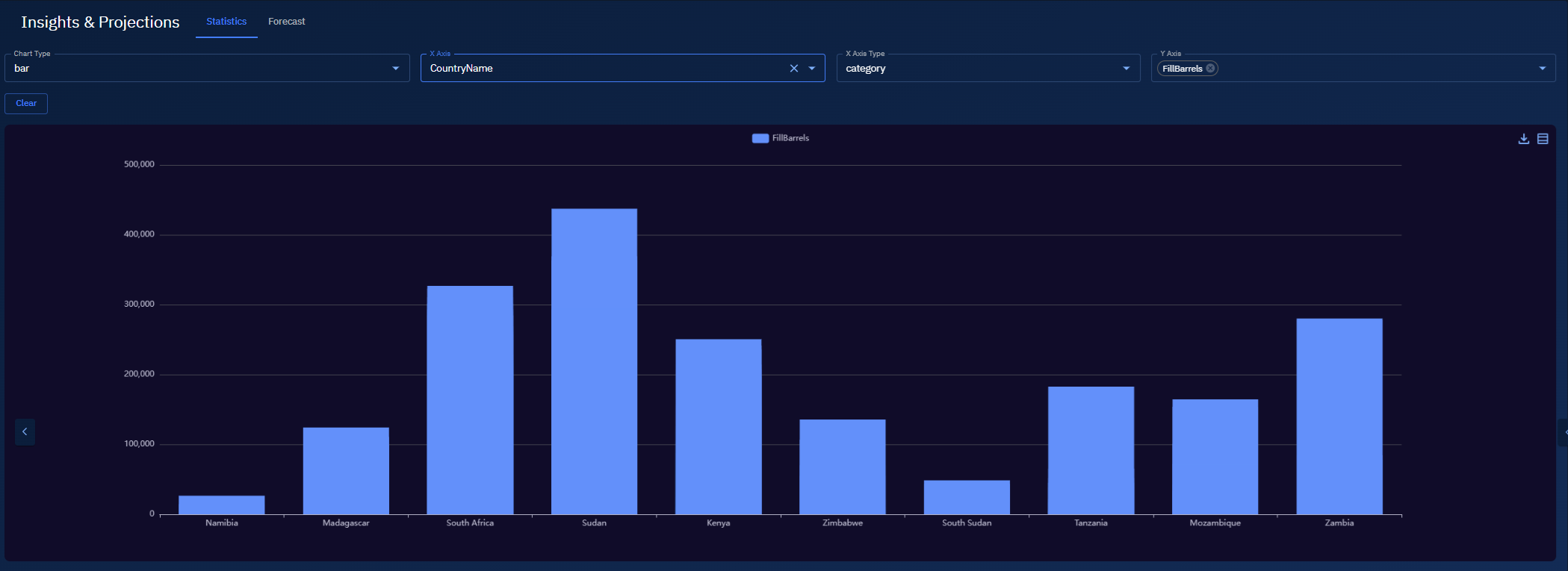
Bar chart
Use a Bar chart to compare categories (for example, by country or region).
Pre-requisities
-
Your
.csvis uploaded and mapped. -
You have a categorical column for X (e.g.,
CountryName,RegionName) and a numeric column for Y (e.g.,FillBarrels).
To view a bar chart, do the following:
-
Open your Workspace that contains the mapped
.csv. -
Select the Insights tab, and then select the Statistics tab.
-
In Chart Type drop-down list, select the Bar option.
-
In X-Axis drop-down list, select a categorical column (e.g.,
CountryName). -
In X-Axis Type drop-down list, select the Category option.
-
In Y-Axis drop-down list, select a numeric column (e.g.,
FillBarrels).
A bar chart is displayed.
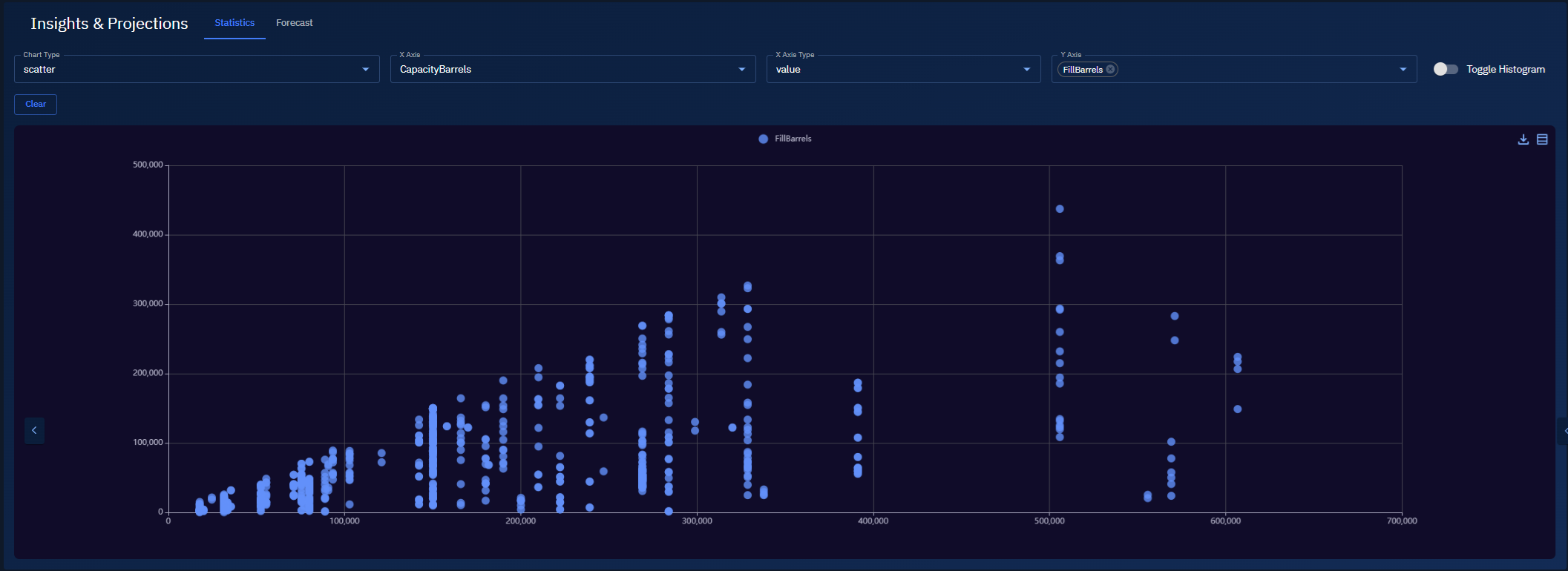
Scatter chart
Use a Scatter chart to examine the relationship between two numeric columns.
Pre-requisities
-
Your
.csvis uploaded and mapped. -
You have numeric columns for both axes (e.g.,
CapacityBarrelsandFillBarrels).
To view a bar chart, do the following:
-
Open your Workspace that contains the mapped
.csv. -
Select the Insights tab, and then select the Statistics tab.
-
In Chart Type drop-down list, select the Scatter option.
-
In X-Axis drop-down list, select a numeric column (e.g.,
CapacityBarrels). -
In X-Axis Type drop-down list, select the Value option.
- Use Log if values span several orders of magnitude.
-
In Y-Axis, select a numeric column (e.g.,
FillBarrels).
A scatter plot is displayed.
Line3D chart
Use Line3D for a 3D perspective on a line series—helpful when the 2D line is dense or hard to read.
-
Open your Workspace that contains the mapped
.csv. -
Select the Insights tab, and then select the Statistics tab.
-
In Chart Type drop-down list, choose Line3D.
-
In X-Axis drop-down list, pick an available time column (e.g.,
PublishTime,FirstReportTime, or any timestamp you see).
If you don’t have any time column mapped: pick a categorical column (e.g., CountryName or RegionName) or a numeric column (e.g., CapacityBarrels).
-
In X-Axis Type drop-down list, do one of the following:
-
Select Time if you picked a timestamp in step 4.
-
Select Category for names/labels
-
Select Value (or Log) for numeric X.
-
-
In Y-Axis drop-down list, select a numeric column (e.g.,
FillBarrels). -
In Z Axis drop-down list, choose a dimension that adds depth:
-
Prefer a numeric column (e.g.,
CapacityBarrels) to show variation along Z,or
-
If you do have a second time-like field, you can use that instead to layer by time.
-
A Line3D chart is displayed.